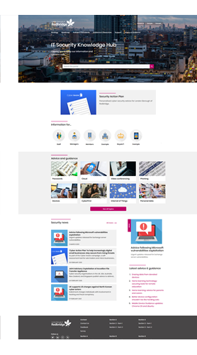
Creating a new IT Security Knowledge Hub
Jeremy Ranger-Green , Tuesday 20 April 2021
The vision
Our vision for the site is to deliver a one stop shop on IT security for staff and members, which will help them understand concepts and ensure adequate security and protection of data/information in digital services are in place. This covers:
- Policies, processes, standards, best practices and guidelines
- Events and opportunities e.g. conferences, webinars, partner initiatives, central Government information
- Training
- News and blogs
 Choosing a platform
To deliver this site we started by identifying principles for design and content. These would help us going forward when we were looking at platforms to build the site on, in creating the right look and feel for the site and its templates, its imagery and how we would write content for it.
First thing needed was to find the right platform for the site. Do we use tried and tested platforms that we have used previously like WordPress? Or Umbraco? Or try something new?
The decision was made. We were going to use Umbraco content management system and create a Redbridge standard template site on this. By creating a template site, that includes many common content types, such as news and blogs, we would be able to create and install other sites more rapidly in the future. As we were familiar with this platform, we could develop and implement it fairly quickly, plus it offered 95% of the features already – we just needed to implement them.
Our design process
At our initial meeting, it was important that everyone agreed to the following design principles.
- Engaging and intuitive site that attracts users to it
- Not to look like a static site that doesn’t change. We wanted the content to be dynamic, e.g. pulling in news feeds from elsewhere
- The portal must load quickly, both on both the desktop and mobile
- Pages must be consistent in layout which meant the templates were needed for different content
- Must be simple
- Must have defined colour, type, imagery templates for key sections and topics of the portal
- Must have a focal point that shows visitors where the most important information is
- Must be easy to read
- Use short sentences and paragraphs
- Must avoid larges pages of text
These design principles definitely helped us to make the site aesthetic, user-friendly, effective and engaging and enhanced the usability of it.
Challenges
Although we have implemented many different types of single sign on with many different platforms, this was our first time at using Active Directory to authenticate both those using the site and site editors. However, using experience gained from this authentication method elsewhere, we were able to soon integrate it into the site.